
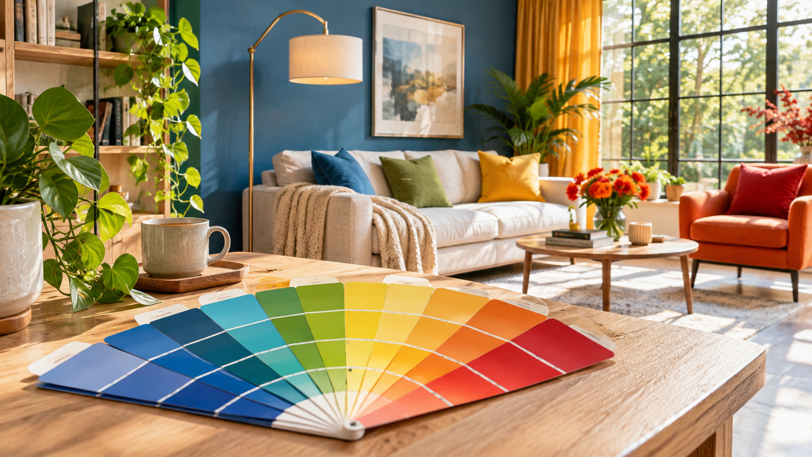
Why do some rooms feel cosy and relaxing, while others seem cold, tense or visually overwhelming? Why do we associate red with passion, blue with calmness and yellow with happiness?
Colour psychology explores how we perceive colours, the meanings we attach to them and how they may be associated with our emotions and behaviour.
Colours are everywhere – in nature, clothing, food, advertising and the spaces we inhabit. They can attract attention, evoke associations and influence how we evaluate our surroundings.
However, scientific research shows that their effects are more complex than popular advice often suggests.
There is no universal colour that guarantees calmness, happiness or better concentration.
What Is Colour Psychology?
Colour psychology is a field of research that examines the relationships between colour perception, emotions, cognitive processes and behaviour.
In a scientific review published in the Annual Review of Psychology, Elliot and Maier explain that colours can carry psychological meaning and influence how people perceive particular situations.
However, these effects depend on context.
For example, red may be associated with love and attraction, but also with danger, mistakes or warnings.
Its meaning changes depending on the circumstances, personal experience and cultural environment.
Colour psychology is therefore not a system of universal rules suggesting that “blue calms people down” or “red causes aggression”.
Instead, it investigates possible associations that may vary between individuals and situations.
What Does Scientific Research Show?
A large international study by Jonauskaite and colleagues, published in 2020, involved 4,598 participants from 30 countries.
The researchers identified considerable similarities in colour–emotion associations across different cultures.
For example, certain colours were more frequently associated with happiness, calmness, sadness or heightened emotional arousal.
At the same time, language, culture and geographical proximity also influenced these associations.
A more recent systematic review, published in 2025, brought together 132 scientific studies involving 42,266 participants from 64 countries.
The findings suggest that recurring patterns exist in how people associate colours with emotions.
However, an important distinction must be made:
Associating a particular colour with an emotion does not mean that seeing that colour will necessarily produce the same emotion.
For example, someone may associate yellow with happiness without necessarily feeling happier in a yellow room.
Most studies assess these types of associations rather than immediate changes in mood.
What Emotions Do We Associate with Different Colours?
Some colour associations appear relatively frequently in scientific research.
However, they should not be interpreted as universal psychological effects.
Red: Energy, Love and Warning
Red is often associated with intense emotions – love, passion and excitement, but also anger or danger.
Context determines which meaning becomes more prominent.
A red rose, a red traffic light and a red mark on an examination paper may evoke entirely different interpretations.
Blue: Calmness and Stability
Blue is frequently associated with calmness, trust and security.
These associations may partly reflect familiar natural images, such as the sky and water.
However, not all shades are perceived in the same way.
Light blue may appear airy and spacious, while dark blue may create an impression of seriousness or distance.
Green: Nature and Restoration
Green is often associated with nature, growth and tranquillity.
Many people perceive it as a pleasant colour in residential environments.
However, it is important to distinguish between the effects of natural environments and the effects of the colour green itself.
A view of a park involves much more than colour – natural light, shapes, space and other sensory stimuli.
Yellow and Orange: Warmth and Vitality
These colours are often associated with happiness, energy and activity.
However, bright and highly saturated shades may feel visually overwhelming to some people, particularly when used across large surfaces.
Softer tones may create a very different impression.
Black, White and Grey
Black is frequently associated with seriousness, elegance or sadness. White may symbolise cleanliness, light and simplicity, while grey can suggest neutrality or restraint.
However, these meanings vary across cultures and situations.
The same colour may be perceived as stylish, calming or oppressive, depending on its surroundings and individual preferences.
How Do Colours Influence Our Perception of Space?
When choosing colours for our homes or workplaces, it is important to consider not only individual shades but also the overall environment.
Our perception of a room depends on:
- Natural and artificial lighting.
- The size and proportions of the room.
- Colour saturation and brightness.
- Furniture and materials.
- Contrast between different surfaces.
- Personal preferences and the purpose of the space.
A study by Küller and colleagues examining workplace environments found associations between lighting, colour design and employees’ psychological mood.
The way people perceive the quality of light appears to be particularly important.
Another study by Güneş and Olguntürk explored emotional associations with differently coloured interiors and identified variations in participants’ evaluations.
However, this does not mean that there is a universal colour scheme for productivity or relaxation.
A suitable interior combines functionality, good lighting and a visual environment that feels comfortable for the people using it.
How Can We Choose Colours for Our Homes and Workplaces?
There is no need to follow strict psychological rules. A few practical principles can be more helpful.
1. Consider the Purpose of the Room
Think about the activities that will take place in the space.
For a bedroom, you may prefer soft shades that personally give you a sense of calm.
For a workspace, good lighting, readability and minimising visual distractions are also important.
2. Pay Attention to Lighting
The same colour can appear different under natural and artificial light.
Before painting an entire wall, apply a sample and observe it at different times of day.
This may help you avoid choosing a colour that looks appealing in a shop but does not work as well in your particular room.
3. Use Contrast Thoughtfully
Contrasting colours can attract attention and highlight particular features.
However, when too many bright surfaces compete for attention, a space may feel visually overwhelming.
The balance between main colours and accents matters more than following a rigid rule about how many colours to use.
4. Consider the People Using the Space
There is no reason to choose blue simply because it is considered calming if you personally dislike the colour.
Preferences are influenced by memories, culture, personal experiences and individual differences.
In shared workplaces, it is helpful to consider the needs of different people, including visual comfort and accessibility.
5. Notice How You Feel in the Finished Space
Rather than relying entirely on theory, pay attention to your own reactions.
Does the environment help you concentrate? Do you feel comfortable? Are there elements that distract or overwhelm you?
Sometimes adjusting the lighting or rearranging furniture may be more beneficial than changing the colour of the walls.
Can Colours Improve Mental Health?
A pleasant, well-organised environment may contribute to everyday comfort and wellbeing.
However, scientific evidence does not support claims that a particular colour can independently treat depression, anxiety or other mental health disorders.
So-called “colour therapy” should not be presented as a substitute for evidence-based medical or psychological interventions.
It is also important not to confuse colour psychology with medical applications of light, such as light therapy used for certain mood disorders and circadian rhythm disturbances. These are different approaches.
Conclusion: Colours Matter, but They Do Not Affect Everyone in the Same Way
Colour psychology shows that colour perception is connected to our emotions, memories, cultural associations and evaluations of our surroundings.
Scientific studies identify recurring patterns in these relationships, but they do not establish that every colour has the same effect on everyone.
The best colour choice is not necessarily the one that promises a particular mood, but the one that suits the purpose of the space and our individual needs.
Colours can make our homes and working environments more pleasant, functional and personally meaningful.
However, psychological wellbeing depends on much more than the colour palette surrounding us.
Scientific sources
- Elliot, A. J., & Maier, M. A. (2014). Color psychology: Effects of perceiving color on psychological functioning in humans. Annual Review of Psychology, 65, 95–120. https://doi.org/10.1146/annurev-psych-010213-115035
- Jonauskaite, D., Abu-Akel, A., Dael, N., et al. (2020). Universal patterns in color-emotion associations are further shaped by linguistic and geographic proximity. Psychological Science, 31(10), 1245–1260. https://doi.org/10.1177/0956797620948810
- Jonauskaite, D., & Mohr, C. (2025). Do we feel colours? A systematic review of 128 years of psychological research linking colours and emotions. Psychonomic Bulletin & Review, 32, 1457–1486. https://doi.org/10.3758/s13423-024-02615-z
- Küller, R., Ballal, S., Laike, T., Mikellides, B., & Tonello, G. (2006). The impact of light and colour on psychological mood: A cross-cultural study of indoor work environments. Ergonomics, 49(14), 1496–1507. https://doi.org/10.1080/00140130600858142
- Güneş, E., & Olguntürk, N. (2020). Color-emotion associations in interiors. Color Research & Application, 45. https://doi.org/10.1002/col.22443
Edited and scientifically updated by: The Somenso Team
This article has been updated with additional scientific references, contemporary research and practical recommendations concerning the influence of colours on perception and psychological wellbeing.
Read more